
The misuse and abuse of correlation
We’ve all heard the phrase, “Lies, damned lies and statistics 1. The message being that if used improperly, statistics and the graphical representation of those statistics can be misleading, as the examples below highlight.

We’ve previously written about some of the nuances around the most commonly used statistic, correlation, here, here and here. Despite its simplicity, the correlation model is misused in our industry frequently. This will be the first insight in a series where we look at the many ways correlation is misused and abused.
So why is this important?
Well, correlation is used to understand how the returns on various asset classes move in relation to each other. With this knowledge we can then attempt to build diversified multi asset portfolios. If we fail to understand how assets move relative to each other over various horizons, then our portfolios may not be as diversified as we think.
In this first insight, we examine how graphical representations of correlation can be misleading.
Correlation is just one of many different ways to measure the relationship between different variables. For example, we might be interested in how the returns of a particular equity index (variable X) behave relative to a bond index (variable Y). This then helps us determine how much diversification benefit we get from combining them in a portfolio.
The result of the correlation calculation is a ‘correlation coefficient’, which ranges from -1 (i.e. the strongest negative relationship) to +1 (i.e. the strongest positive relationship). A value of 0 indicates no relationship between the variables.
However, before interpreting and applying correlation results to portfolio construction, it is important to understand some key assumptions that underpin the calculations. These assumptions are listed and explained below. While the explanations are simplified to avoid getting bogged down in technical nuances, they still provide guidance on the principles involved.
Key correlation assumptions:
- The relationship between variables is linear. This means if you plot the two variables on a graph, you should be able to draw an approximate straight line through the points.
- The mean and variance of the variables is constant This means the individual data points for each variable fluctuate around an average value (i.e. mean) that remains constant and the average size of that fluctuation (i.e. variance) also remains constant.
- The data points in your sample are independent. This means you shouldn’t be able to predict one observation in a series from the previous observation.
It is only if these assumptions hold that correlation can be a good measure of the direction (i.e. positive or negative) and strength of the relationship between the variables. But if these assumptions don’t hold, correlation can give you very misleading results.
For example, Figure 1 shows two variables (X and Y) plotted on charts. These could represent the returns of two assets for instance. Given the left-hand chart shows a curved line, the relationship between them is clearly not linear, and therefore violates a key assumption that underpins correlation calculations.
In this instance, the standard calculation produces a correlation coefficient of 0, which suggests there is no relationship between the variables. This is clearly wrong because there is actually a strong and well-defined relationship between X and Y (defined by Y = X2). It is just not a linear relationship, which is why the correlation calculation gives misleading results.
Additionally, the right-hand chart shows each variable plotted over time (i.e. time series) and also doesn’t suggest any strong relationship, even though we know there is one. This demonstrates how misleading the correlation number can be when the relationships involved are not linear.
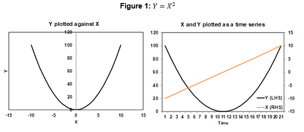
Figure 2 two plots exactly the same two variables, but only for the positive X values.
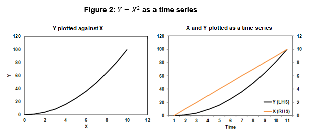
The correlation coefficient is now 0.97, which indicates a strong positive correlation. So we get completely different correlation numbers, even though we have exactly the same variables with exactly the same relationship. A visual inspection of the right-hand time series chart also now indicates a strong positive correlation.
This reinforces how misleading correlation numbers are, when the relationship between variables is not linear.
A real-world example of this can be found in the relationship between equity prices and credit spreads, which are a measure of credit risk as reflected in corporate bond prices. For modest movements in equity prices, there is usually minimal change in average credit spreads, but large equity price moves tend to correlate with credit spreads and suggesting that the relationship between equity prices and credit spreads is not linear. This means standard correlation calculations can lead to the incorrect conclusion that equities and credit investments are uncorrelated. They may well be uncorrelated for modest equity movements but tend to become highly correlated for large movements, for example in severe adverse scenarios.
The reason for this may be due investors’ perceptions about the ability of a firm to cover its debts. A firm’s equity price is meant to represent the value of the assets of a company. The two relationships below help us to understand the relationship between an equity’s price and its leverage ratio.

We can see that if total debt remains constant then, a fall in the equity price can increase the leverage ratio. It is conceivable then, that investors will become more concerned about a corporate’s ability to pay its debt when the equity price falls below a certain level. And it is at this point where the equity price may influence credit spreads. The literature also demonstrates the highly non linear relationship between credit spreads and the equity market, particularly during times of stress 5 6 7 8.
Avramov et al. (2009) present evidence that the relation between default risk and stock returns is driven by the firms with low credit quality during turbulent time periods. However, during tranquil periods there is no clear relation between default risk and stock returns.” 9
We have previously written about “equity beta” in credit spreads here.
The second assumption listed earlier relates to constant mean and variance. In practice this means correlation (either calculated numerically or via visual inspection of charts) will be misleading when either or both variables exhibit long term trends (i.e. their mean and variance are changing). Such trending behaviour may also violate the third assumption of independence.
In these cases, the variables may be trending up or down together over long time horizons but may move in opposite directions over shorter periods. The relationship between two series can only be assessed after the horizon of interest has been defined.
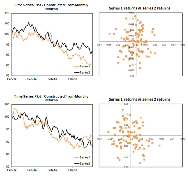
For example, Figure 3 plots two constructed series which have a long term positive trend, but which also by construction are negatively correlated over 24 month horizons. If we calculate the correlation coefficient on observations of the levels, we get +99%, an almost perfect positive relationship between the two series. Based on this extremely high correlation and visual inspection of the chart below we might conclude that these two series always move in the same direction over all horizons. But this is not the case.
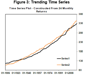
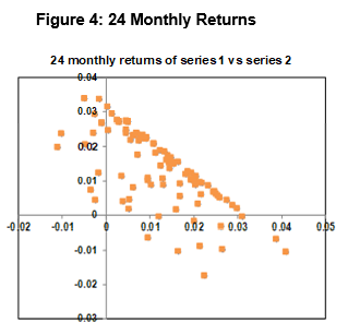
Figure 4 plots the 24 monthly returns of series two against the 24 monthly returns of series one. There is a very strong negative linear relationship between the returns of the two series. This tells us that over any 24-month period, if series one appreciates, series two will depreciate.
Why is this happening? The series share behaviour (trend) over the long term, but not over the short term.
A snapshot over a smaller time frame is shown below in Figure 5. The series is negatively correlated over the shorter horizon of 24 months. The positive correlation we calculated earlier combined with the time series plot is misleading and doesn’t tell us how the series is related over shorter timeframes which are more relevant to our investment horizon.
This example also highlights how the length of the dataset can frame our assessment of the relationship between the series. In longer series, our eye is drawn to the trend. With shorter series, the shorter term relationships are magnified.
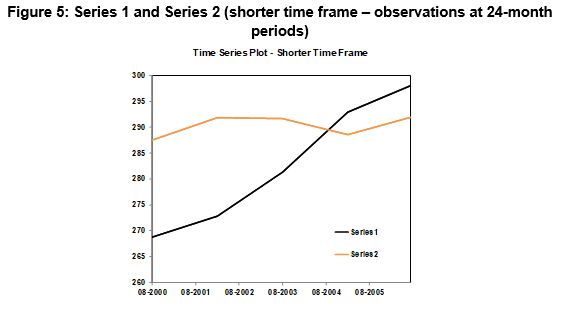
The fact that there appears to be a positive relationship, when in fact the series move in opposite directions over shorter time frames highlights the dangers of using visual inspection of levels of time series to establish whether a constant relationship exist over all horizons.
A trend over a small data sample may just be a low frequency fluctuation (possibly as part of a cycle) in the longer series. The observed time series is just a snap shot of an unknown much longer series. The nature of the relationship will be a function of the length of the horizon.
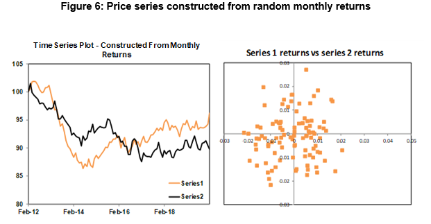
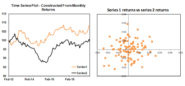
Figure 6 further illustrates the dangers of inferring a relationship between time series based on visual inspection. Two sets of random returns were generated, and from these two sets of random returns two price series were constructed. The two series appear to be correlated, but they are not. The plot of the monthly returns shows there is no relationship between the two series.
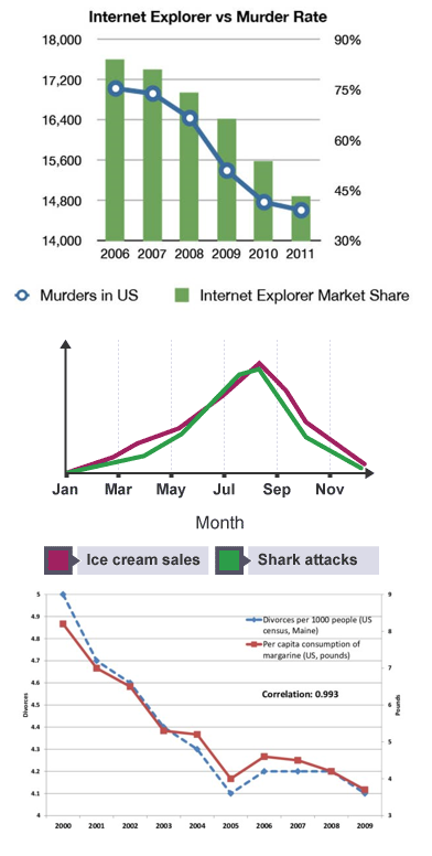
These examples highlight how even the most simplest of models, if utilised incorrectly, can lead to erroneous conclusions. We leave you with some more amusing and possibly spurious correlation examples.
1 https://en.wikipedia.org/wiki/Lies,_damned_lies,_and_statistics
2 https://www.statisticshowto.datasciencecentral.com/misleading-graphs/
3 https://grist.org/article/national-review-proves-climate-change-isnt-real-with-one-simple-chart/
4 https://www.datapine.com/blog/common-data-visualization-mistakes/
5 https://link.springer.com/article/10.1007/s12197-017-9423-9
6 https://www.sciencedirect.com/science/article/pii/S1042443117304560
7 https://www.sciencedirect.com/science/article/abs/pii/S0378426613003014
8 https://onlinelibrary.wiley.com/doi/abs/10.1111/j.1540-6261.2011.01652.x
9 https://www.sciencedirect.com/science/article/pii/S1042443117304560#b0030
This material has been prepared by Ardea Investment Management Pty Limited (Ardea IM) (ABN 50 132 902 722, AFSL 329 828). It is general information only and is not intended to provide you with financial advice or take into account your objectives, financial situation or needs. To the extent permitted by law, no liability is accepted for any loss or damage as a result of any reliance on this information. Any projections are based on assumptions which we believe are reasonable, but are subject to change and should not be relied upon. Past performance is not a reliable indicator of future performance. Neither any particular rate of return nor capital invested are guaranteed.