
Credit is the Canary
Following last week’s meeting of the US Federal Reserve (FED), markets have become increasingly concerned that the FED is making a policy mistake in continuing to increase interest rates. The fear is that the FED will tighten monetary policy to the point where it causes a recession.
If you’re looking for an early warning indicator as to whether this is actually happening – a financial equivalent of the canary in a coal mine – look to credit markets.
While equities get most of the headline attention, it’s actually credit markets that a have a more immediate impact on the underlying economy. This is because companies rely on credit (via bonds and loans) to finance their ongoing business activities.
When credit markets get disrupted, the cost of financing these activities goes up due to rising credit spreads, or even worse, companies are unable to access funding altogether. They may then be forced to scale back their businesses, cut jobs and in the worst case, default on their existing debt. If this happens to enough companies at the same time it can trigger a recession.
So, what’s the canary telling us? The charts below give us some insight … and tell us the credit canary is looking a bit sick.
The first chart shows the S&P/LSTA Leveraged Loan Price Index, which is a benchmark index that tracks prices in the US leveraged loan market. This is a market where companies with more stretched balance sheets borrow funds to finance their operations, the same companies that tend to get hit first when credit markets get disrupted.
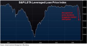
What’s particularly concerning here is the speed of the price decline, which suggests market disruption.
The last time this market dipped was during the China led ‘risk-off’ period in 2015/2016. At that time the index dropped 8.5% peak to trough over 10 months. This time it has already dropped 4.5% in less than 3 months, in an environment where economic growth is still good and default rates are very low.
That might not sound like much compared to equities, but remember this is a market that companies regularly rely on to keep their businesses going, unlike equity markets where they can usually afford to hold off raising equity financing until market conditions improve. This is also an asset class that is marketed to investors as a ‘stable’ income source.
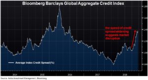
The second chart shows a broader index tracking global corporate bond markets and is more weighted to higher quality companies. This index is also showing a similarly speedy decline in recent weeks, as reflected in widening credit spreads.
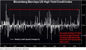
The final chart shows credit spreads in the US high yield bond market, which last week experienced its largest weekly credit spread widening since the Eurozone debt crisis in 2011.
No doubt the moves shown in these charts are being impacted by poor liquidity. While some may dismiss this as being just a year end phenomenon, we think the deterioration in liquidity is actually structural in nature. (refer – Early warning indicators, Corporate bonds more risk for less return)
Heading into 2019, it is credit rather than equity markets you should be watching closely for signs of the feared FED policy mistake.