
Does duration still diversify equity risk?
Download Research Note: Does duration still diversify equity risk? (PDF)
- Bonds will continue to provide diversification if bond volatility is lower than equity volatility even if the correlation between them is positive
- All else equal we require bond volatility to be “low” for consistent diversification, but the best outcome is achieved when there is negative correlation and low bond volatility
- A longer investment horizon increases the attractiveness of duration.
1. Introduction
We have written extensively about the role of duration (aka government bonds) in an equity heavy portfolio here, here and here. And this time we thought we’d bring a bit more statistical modelling to the diversification discussion. In this note we:
- Statistically evaluate whether it is more important for government bonds to exhibit negative correlation with equities or to exhibit lower volatility than equities
- Perform scenario tests to understand how different economic environments impact the diversification benefits of bonds
- Explain why a longer investment horizon may make duration a more attractive investment
Before we get into the statistics, let’s first summarise the problem investors currently face. There’s a few things investors expect from their duration exposure, one of these being that government bonds should diversify equity risk. Recently investors are starting to question this expectation for a couple of reasons. The first reason is interest rates are at 120 year lows which means there isn’t much room for yields to fall if we experience another crisis like the one we did over March. The second is central banks are intervening in rates markets to an unprecedented extent, and so perhaps the way things behaved in the past won’t be how they behave in the future.
2. Diversification
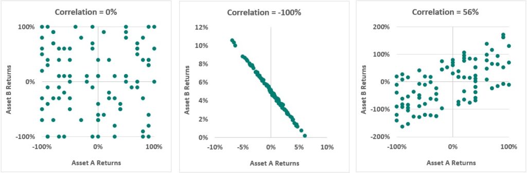
Diversification is an investment strategy which lowers a portfolio’s volatility and provides more stable returns for an investor. The two important ingredients for a diversified portfolio are correlation and volatility. So, let’s first delve a little deeper into correlation, and in particular the bond equity correlation. The commonly accepted rule of thumb is government bond returns are negatively correlated with equity returns and that’s how bonds provide diversification. By this we mean that when equities are down, then bonds should be up. But is this the correct interpretation? Let’s ignore the charts below for now and begin with a qualitative definition of correlation. Correlation measures the sign and strength of a linear relationship between two variables. it is bound between minus 1 and positive 1. Or put another way it is bound between -100% or +100%. The closer correlation is to -1 or 1, the stronger the relationship is between the two variables. The closer it is to zero, the weaker the relationship. For example, if correlation between the returns on two assets is -1, then we say they are perfectly negatively correlated. And this means that when one asset’s return is increasing the other asset’s returns are decreasing with 100% certainty. Does this mean though, that if equities are down then bonds will always be up?
Let’s focus on the first chart on the left. The one with the heading Correlation = 0%. Here random returns for asset A and asset B were generated. Asset B’s returns are shown on the vertical axis against asset A’s returns on the horizontal axis. Visually, this chart shows that sometimes asset B’s returns are negative when asset A has positive returns, and sometimes they both have negative returns and sometimes they both have positive returns. In general, it would be hard to predict whether asset B’s returns are increasing or decreasing from asset A’s returns. There appears to be a random relationship. When we calculate the correlation, it does indeed turn out to be zero.
Let’s look at the middle chart. The correlation is -1 or -100%. This tells us that, when the returns on asset A are increasing, the returns on asset B are decreasing and vice versa. From this chart, if we knew what asset A’s return is, we would know with certainty that if asset A’s returns are increasing then asset B’s returns are decreasing. This is a strong negative linear relationship. What this chart also tells us is that a perfect negative correlation does not imply that if asset A’s returns are positive then asset B’s returns will always be negative as we can see that sometimes asset A’s returns are positive and so are asset B’s returns.
Now for the last chart. Here the correlation between two assets is 56%. This tells us the relationship is positive but not as strong as if the correlation were 1 or 100%. So, we can say in general that when returns on asset A are increasing then returns on asset B are also increasing, however, not all the time. If we knew the return on asset A we could predict the return on asset B, but we wouldn’t be very certain about what the return on asset B would be.
So now we understand what correlation is, and that negative correlation doesn’t mean an inverse relationship between returns, let’s get back to the negative correlation rule of thumb. The rule of thumb when an investor is building a diversified portfolio is that an investor should combine negatively correlated assets to reduce volatility at the portfolio level. So, based on that definition you might think the two assets in the middle chart give you the best outcome. However, we know rules are meant to be broken and it turns out correlation is only part of the answer.
Which two assets would give you the lowest total portfolio volatility?
The expression below tells us how much risk each asset in the portfolio contributes to total portfolio risk.

We can see that an asset’s contribution to total portfolio volatility comprises exposure, (how much you have of that asset in the portfolio), volatility of the asset and correlation of the asset with the rest of the portfolio. There are three moving parts, it’s not just correlation that matters.
The analysis below shows why it’s important to look at a portfolio and its components from multiple angles. Let’s look at the chart first. The first bar on the left shows the asset allocation for a portfolio which consists of global government bonds and global equities both 100% hedged so there’s no currency exposure. The MSCI world index represents world equities and the Bloomberg global aggregate treasury index represents global bonds.
Portfolio Risk Decomposition^
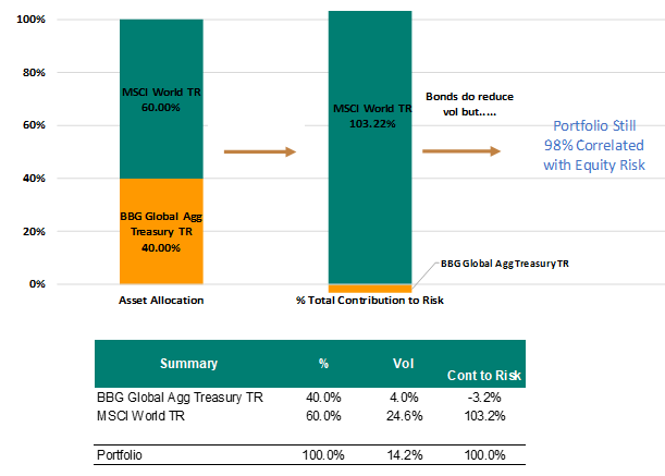
We have calculated the contribution to volatility(risk) for both equities and government bonds using the expression above. The chart shows that government bonds provide a small negative contribution to volatility and equities contribute the most to volatility (the correlation between bonds and equities over the period was -40%). There are a few really interesting things to note here that are really important for understanding how to construct a portfolio. The first is equities are much more volatile than bonds as the contribution to volatility is disproportionate to their exposure. There’s a 60% allocation to equities but the contribution to volatility is much larger than 60%. In fact, when we calculate the correlation of the portfolio with equities, there’s still a really high 98% correlation. So does this mean there’s no point adding bonds to the portfolio and that bonds are not adding any diversification? No, it doesn’t. If we look at the table below the chart, the third column from the left shows the volatility for each asset and the total portfolio volatility on the portfolio in the bottom row. We can see volatility of government bonds is 4% and the volatility of equities is 24.6%. If an investor were to hold only equities, the volatility on the portfolio would be a whopping 24.6%. However, if they add 40% of government bonds then the volatility drops to 14.2%. This tells us that while the portfolio is still 98% correlated with equities, it won’t experience the same wild swings and that’s what diversification is all about. A smoother more certain return profile.
Now what’s hopefully becoming clear is that it is unclear as to whether it’s the negative correlation or the lower volatility of bonds that provide this diversification. In the next section we will perform a series of scenario tests to explore this question further. Before we do this, it makes sense to see what the volatility of bonds and the correlation between equities and bonds has looked like historically.
Drawdowns*
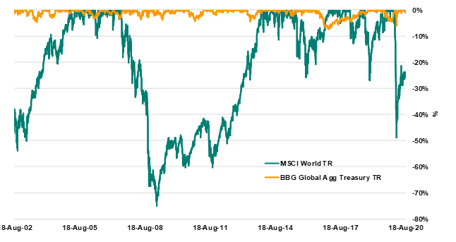
The chart above shows the drawdowns for bonds and equities since August 2002. A drawdown measures the decline in the value of an asset from the last peak (before a new peak is achieved). It is calculated as a percentage(peak value before the biggest drop – lowest value before the new high divided by the peak value before the largest drop). This chart tells us equities exhibit much greater drawdowns, and are much more volatile than bonds and this helps us to understand the volatility component of the contribution to risk formula as defined previously. So we know bonds have been contributing to diversification via lower volatility historically and it has been pretty consistent. The same however can’t be said of correlation.
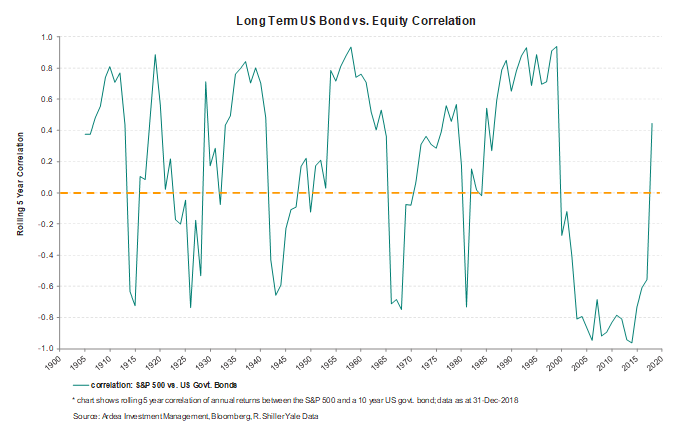
The chart above tells us the correlation between bonds and equities hasn’t been consistently negative. This brings us to the question, if the correlation between bonds and equities is not always consistently strongly negative, how important is the volatility of bonds for providing diversification?
3. Is negative correlation more important than low bond volatility?
We know there are three ingredients important for determining the degree to which government bonds will diversify an equity heavy portfolio. They are exposure, volatility and correlation. In the next few examples we will demonstrate how changing these three ingredients impacts the ability of duration to diversify equity risk.
a. The low bond volatility, varying correlation case
The first thing we are going to look at is how important correlation is when bond volatility is low and we will do this with three examples, where all the inputs stay the same except for the correlation assumption. In the boxes below each of the charts, you’ll notice the assumptions for bond and equity volatility remain constant across the three examples. Correlation varies from -80% in the first box, 0 in the middle box and +80% in the last box. Let’s consider the first chart on the left-hand side and focus on the green line first. This line represents the total volatility on the portfolio as the duration allocation varies from 0% to 100%.
We can see the green line steadily decreases as we increase the duration allocation, and this remains true until the portfolio reaches 100% duration. So, from this we can see that duration is a consistent diversifier given these assumptions because adding more duration consistently decreases total portfolio volatility. If we now examine the chart in the middle, the zero-correlation case, again we see that as the allocation to duration increases the total volatility on the portfolio decreases. If we look at the chart on the far right, we also see that even when correlation is very high, duration still acts as a diversifier because the volatility on the total portfolio steadily decreases as you increase the allocation to bonds. This tells us that, if the volatility of bonds is low, even if correlation is a large positive number then bonds still provided diversification.
But what’s the best outcome? The light blue dots represent the contribution to volatility made by duration as the allocation to duration varies. The charts show that when correlation is large and negative, the contribution to volatility sits mostly below the zero line until the point that the portfolio is 100% duration. When correlation reaches zero, the contribution to volatility is positive. When the correlation is increased to 80%, the contribution to volatility is positive and larger than for the zero-correlation case and the negative correlation case. If we then compare the green line across charts, we can see volatility decreases faster at the portfolio level when correlation is negative (i.e. the preferred outcome is when the blue dots are below zero or relatively lower). This tells us that, if bond volatility is low, bonds can still provide diversification even if correlation is positive, but a better outcome is achieved if volatility is low and correlation is negative.
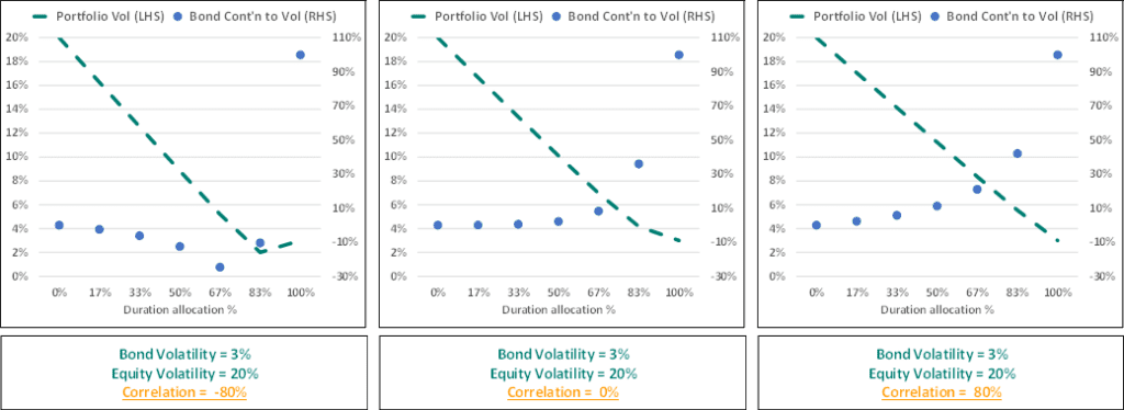
If bond volatility is low, portfolio volatility decreases as bond exposure increases regardless of correlation
Volatility decreases faster if correlation is negative
b. The negative correlation, varying bond volatility case
The next obvious step is then to look at how increased bond volatility changes things. So here we’ve kept correlation constant at -0.4 but increased bond volatility. In the chart on the far left we’ve increased bond volatility from 3% to 6% and we can see that volatility is decreasing until the point that the portfolio is 100% duration.
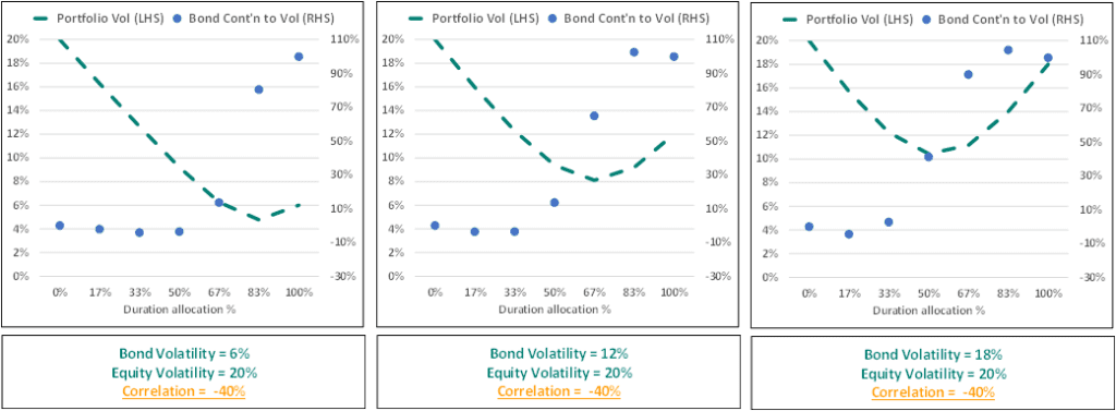
All else equal we need bond volatility to be low for consistent diversification, but the best outcome is achieved when there is negative correlation and low volatility.
If we move on to the next chart, we can see that as we increase bond volatility even more from 6% to 12% then the inflection point at which duration is no longer reducing volatility occurs earlier. So around the 67% mark. In the chart on the far right, bond volatility was increased to 18% and we see that at the 50% mark adding more duration increases total portfolio volatility. From this we conclude that all else equal we need bond volatility to be low for consistent diversification, but that the best outcome is achieved when there is negative correlation and low volatility. However, given rates are at historic lows, and that central banks are using QE instead of cutting rates, it’s probably unlikely that, if we see another economic shock, rates will fall. In which case the negative correlation assumption is questionable.
c. Expected returns and the investment horizon
Up until this point returns have been excluded from the discussion. Obviously expected returns are important and so we first wanted to show you why both your investment horizon and the duration on your bond portfolio matter when it comes to understanding expected returns. So, we all know the “yields up bond prices down” relationship. However, that rule of thumb only applies over shorter horizons. Over the longer term, rising rates are actually good for bonds and we’ll show you why in the example below. If we focus on the table below what we’ve done here is projected the return over the next 15 years for 3 different bond indices, each with a different level of duration for a given interest rate scenario. And that scenario is: rates will stay as they are for a few years and then central banks might start hiking – but we’ve assumed it will be a gradual rise rather than a big hit all at once. We’ve assumed rates will rise by 0.25% each year, over four years beginning in year three shown at the top of the table.
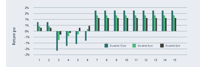
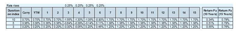
In the second row of the table we can see that the assumed carry is 0.7% for the 10 year duration index. Carry is another word for return and we have estimated carry from the yield to maturity. If central banks made no changes to policy rates, then every year that 10 year bond index would return 0.7% (and we see that for year 1 and year 2). But in year 3, central banks raise rates by 0.25% and we know that if rates rise then bond prices decline and that’s why we see the negative return in year 3. If we look at year 4, again we see that there is a negative return, but it is less than in year 3 and the reason for that is, that in year 3 there was an interest rate rise which means that the yield on the portfolio increased by 0.25% and this negates some of the loss from the rate rise in year 4. In years 5 and 6 we see a similar pattern where the rate rises have a diminishing impact because the previous year’s rates rises have increased the yield on the index. By year 7, there’s no more rate rises, and now the investor can benefit from higher returns as a result of the previous rate hikes.
Let’s consider the next row down (the index with a duration of 5 years). The yield to maturity on this index is 0.36% so we estimate the return each year to be 0.36% if interest rates stay the same. In year 3 when interest rates rise, we see that the negative return is not as large as for the 10 year index, however we see the same pattern as for the 10 year index (once all the rate hikes are finished the investor is now earning a higher return).
An interesting point to note is that when we compare the return p.a. over a 10 year period vs a 15 year period for each index (shown in the box on the far right) we can see that over the 10 year horizon, rising rates increased the expected return per annum for the 3 year and 5 year index when compared to their initial carry. For the 10 year index the return per annum over 10 years is less than if there were no rate rises. However, we can see that over the longer horizon of 15 years, rate rises were good for all indices.
This tell us that both the duration of the bond investment combined with the investment horizon are both important inputs into determining expected return. Over shorter horizons the only way bonds can make positive returns is if central banks cut rates further (but we are already at 120 year lows and central banks appear to be reluctant to do this). If we see rate rises over the short term (perhaps an unlikely scenario), then bonds are likely to exhibit negative returns. However, rate rises over the longer term are good for bonds and so a longer investment horizon increases the attractiveness of duration.
4. Conclusion
To answer the question of whether duration still diversifies equity risk going forward there are a couple of simple questions the investor needs to ask themselves:
- Will bonds continue to exhibit materially lower volatility than equities? If they do, then even if correlation is positive, they will provide diversification.
- What is your investment horizon and are you willing to take on lower expected (and perhaps negative) returns for bonds over the short to medium term to achieve that diversification?
^ Source: Ardea IM and Bloomberg, data August 2001 – August 2020
* Source: Ardea IM and Bloomberg, data August 2002 – August 2020
This material has been prepared by Ardea Investment Management Pty Limited (Ardea IM) (ABN 50 132 902 722, AFSL 329 828). It is general information only and is not intended to provide you with financial advice or take into account your objectives, financial situation or needs. To the extent permitted by law, no liability is accepted for any loss or damage as a result of any reliance on this information. Any projections are based on assumptions which we believe are reasonable, but are subject to change and should not be relied upon. Past performance is not a reliable indicator of future performance. Neither any particular rate of return nor capital invested are guaranteed.